Monday, June 21, 2010

If you want to add more short positions wait for the 'bounce' to pass....


Although I don't normally try to do intra-day predictions, the end of day chart of the $SPX rally channel we've been following makes it obvious that a pretty good bounce is coming. Let it pass before adding shorts...

Larry Edelson with an interesting market roadmap...

http://www.uncommonwisdomdaily.com/must-watch-market-signals-9613?FIELD9=2

Some interesting cycles work here..we'll see how well he does, he could be right...

We had our little 'pop' this morning..looks like it turned into a nice reversal....

Especially on the $NDX...but all indexes are sporting what are arguably, reversal patterns...

A Hole in the World - Naomi Klein

http://www.opednews.com/articles/1/Gulf-oil-spill-A-hole-in-by-Naomi-Klein-100619-113.html

Hubris personified.....

Pretty good pop, a little surprising..


In one swoop, market action passed through the 1.272 trendline (dark magenta in the top chart) and almost touched the last line in the sand, the 1.317 trendline (orange in the top chart).

Both trendlines can also be seen in the bottom chart, both are orange, and close together, with price action on the top one, but not through it...

Again, the top chart can be seen as a 'blow up' of the last part of the bottom chart, with the rally channel added in, as dashed lines...

The high of 1131.23 reached this morning was 1.01% above the 1.272 trendline and .13% below the more extreme 1.317 trendline. Most of the time, price action has to exceed a major trendline by 1% or so for a reversal to happen anyway...

Sunday, June 20, 2010

Interesting chart by Hopper...


He's getting a similar result, that the top is in or close...

His comments:

I added upper and lower limits to show the oscillator channel (hit the bottom blue and buy, hit the top red and sell (or short)). Also one can see the channel moving as well. Appling EW, we could be hitting "B" (if A-B-C decline).

Very interesting work...

Renaissance 2.0

http://www.youtube.com/watch?v=Zw3i5Rzpx5A

The Vortex...

Some more rally detail...


Look at the annotations on the upper chart first...Click on each one to enlarge...

Just for info, '3>1' refers to trendlines generated from the rally top on 1/19/10 and '5>1' refers to the 4/26/10 rally top, both large scale events from the 2009-2010 rally. They are from Elliott notation, counting waves...you know, wave 3, wave 5....

I'm not sure why it happened, but the slight, residual positive bias in the market after the rally channel stalled mid-week seems related to that violet 3>1 trendline in the lower chart. First it was a nominal resistance, that didn't do much, and lately, it has become support, and the highs of recent days have paralleled it in a sloppy fashion....

The next act in the show, is the big trendline coming down from above, which is now almost in contact with the price action...

Saturday, June 19, 2010

Mike Larson - The snowball effect

http://www.moneyandmarkets.com/the-%e2%80%9csnowball%e2%80%9d-scenario-sinks-sovereigns-39440

Inevitable. Everywhere.

Max and Stacy do a fascinating presentation

If you want to see the future you have to understand the past and present. I know of very few in the league of these two for helping us do this...

http://ia360702.us.archive.org/11/items/MaxKeiserRadio-TheTruthAboutMarketsUsa-Pilot3-19June2010/tamusa-190610.mp3

Remember to suspend your natural tendency to think like a pre-programmed serf before you listen to these two. They present unconventional truth best grasped by free thinkers who call a spade a spade. No left or right wing spin, No political correctness, No that can't be or can't be happening here, No ideological BS permitted....Just raw, blunt, clever and unusual insight into the web of corruption and pathology that is enveloping the social fabric, ecosystem, and financial markets...

The higher you fly (intellectually) the smaller you appear to those who can't fly....Frederick Nietzsche

Friday, June 18, 2010

$SPX trendlines (not all of them as in the last post from yesterday) just the ones we're directly involved with...


Plus the lower 'return' trendline, used to construct the 'channel', which is derived from the top trendline, and unlike that top trendline it is not the result of a primary computation...

Notice also the way the rally channel from the 6/8 bottom now looks:


Here it is the bottom trendline that is primary and the top one is derived from it by adding a price displacement, same procedure but different ordering of primary and derived, as the top chart in this post.

What's interesting on the rally channel chart is that the price action is no longer climbing right up it so much as it's sliding across the top of it, albeit with a slight upward bias. I think that bias ends as the 1.272 model's major trendline (as shown in the top chart),lowers over it... Over the last two trading days the $SPX has only advanced less than 3 $SPX points, from 1118.74 to 1121.01, whereas in the first few days of the advance, 5 to 10 points in a day was normal... Basically, the market is following my 1.272 model from the presentation here on this blog last Monday night of three models. The only difference between my modeling and reality is that slight upward bias that I didn't anticipate happening for the moment when the rally channel stalled near the price target, and price action started moving across the channel....
----------------------------------------------------------------------------------------------------------------------------------------
For anyone that didn't read the two posts about 'modeling the rally', that this post is referring to and built on, there is a lot of info in there, and new concepts, so here they are for those that want to review them:

http://marketmathematics.blogspot.com/2010/06/modeling-rally.html


http://marketmathematics.blogspot.com/2010/06/modeling-rally-part-2.html

Thursday, June 17, 2010

All $SPX trendlines at close today

Tomorrow the bright overhead orange trendline is at 1122.17 and the daily Bollinger Bands look to be at about 1123. Hourly bands are at about 1120...Being that they're all pretty close, they should reinforce each other...The narrowing of the hourly Bollinger Bands on the lower chart implies that some significant move is afoot...as does the Fast Volatility measure at the bottom of that chart.


Wednesday, June 16, 2010

A couple of market and trading thoughts...

Now having seen that the market ended up as a ascending wedge, I see why I couldn't get a good entry point for a bullish run. Ascending wedges are a sign of a weak market. Had there been a typical A-B-C pattern in the up move from 6/8/10, there would have been more visits to the lower channel line, I believe...

By all rights, the market should be done with the rally, and with a couple days confirmation, it should be time to really go short....

$SPX channel as of today...


At 1118.74, the $SPX has completed it's price objective for the day, according to the upper channel trendline...Also, it is conforming exactly to the 'unadjusted' 1.272 model I wrote about Monday night....

I suspect now, we have either seen the top today, or it will be tomorrow...But we need corroboration...

One concern I have, is I haven't seen the expected A-B-C pattern, and the price action has only visited the bottom of the channel once and very early on, so there is a chance this market could fake out the Bears by declining here, going to the bottom of the channel and bouncing back for a 'C' wave. Just a thought...

In any event, something is about to happen, notice the terminal wedge:


Update: I took out a small short position just before the close...

Rally now close to the end?

From the sentimenttrader site last night:
And this is the latest 1.272 model :


One warning though, these exponential trendlines like to be reached and exceeded slightly, so don't be surprised if the market gets one last burst of energy and runs a little higher before it fails...

Tuesday, June 15, 2010

Bird brains!

http://www.youtube.com/watch?v=ZPyo_MxRfeo

http://www.youtube.com/watch?v=0bt9xBuGWgw

The Very Angry Tea Party

http://opinionator.blogs.nytimes.com/2010/06/13/the-very-angry-tea-party/?src=me&ref=general

Some truth in this.....

Rally has accelerated...

The daily Bollinger Bands on the $SPX are at about 1131 right now, at this rate they'll be hit tomorrow...1.272 exponential trendlines are at 1126.62 tomorrow, so we have a couple different resistances close together..Could be that a modified 1.272 Scenario is playing out...we'll see...

By the way 1.5% beyond 1126.62, is 1143.52, so this still could end up topping towards the end of the week...

No One Likes To Talk About This (predicted major war) - Larry Edelson

http://www.howestreet.com/articles/index.php?article_id=13722

Although I had to copy and blow up a couple of his charts to see them better, this is worth a read, talks about the high probability of a major war between 2014 and 2017...

For lots of reasons this also makes sense to me..2012 is the year that peak oil really hits big, based on the well predicted crossing of the supply and demand curves, and 2014 is the year that an agreement that gives us almost free nuclear fuel for our reactors from Russian decommissioned warheads comes to an end. So the west in general, and the U.S. in particular, will have a real energy crisis on it's hands and with a desperate population...

$SPX pushing past 1.382 model...


Breaking higher...

See yesterday's posts for explanations...

Geothermal Elbowing its Way into the Mainstream


http://www.safehaven.com/article/17155/geothermal-elbowing-its-way-into-the-mainstream


This a good thing...like Nuclear without the waste....

BP’s Rating Cut by Fitch to Two Levels Above ‘Junk’

http://www.bloomberg.com/apps/news?pid=20601087&sid=akLiysG_VLJQ

As it should be....

Monday, June 14, 2010

Modeling the rally, part 2

The Three Possibilities:


Here you see the small rally channel mapped out in the previous post, and extended to where they intersect the main trendline(s) generated from the entire previous rally (March 2009 Bottom to the April 2010 Top). The arrows point to the point in time and price where the upper channel line shown in the previous post intersects these bigger scale trendlines...

Since major exponential trendlines are often exceeded by about 1 to 1.5 % before they cause a reversal, multiplying the figure shown on the charts above by 1.015 and then matching the new 'updated' prices based on the charts above to the calculated results of the upper channel shown in the last post, that finally gives these slightly revised price points and dates:

Slightly revised three possibilities (models) based on the above exponential chart price trendline intersections increased by 1.5%:

1.272 Basis, 6/18 or 6/21 at 1135.18

1.317 Basis, 6/22 or 6/23 at 1148.37

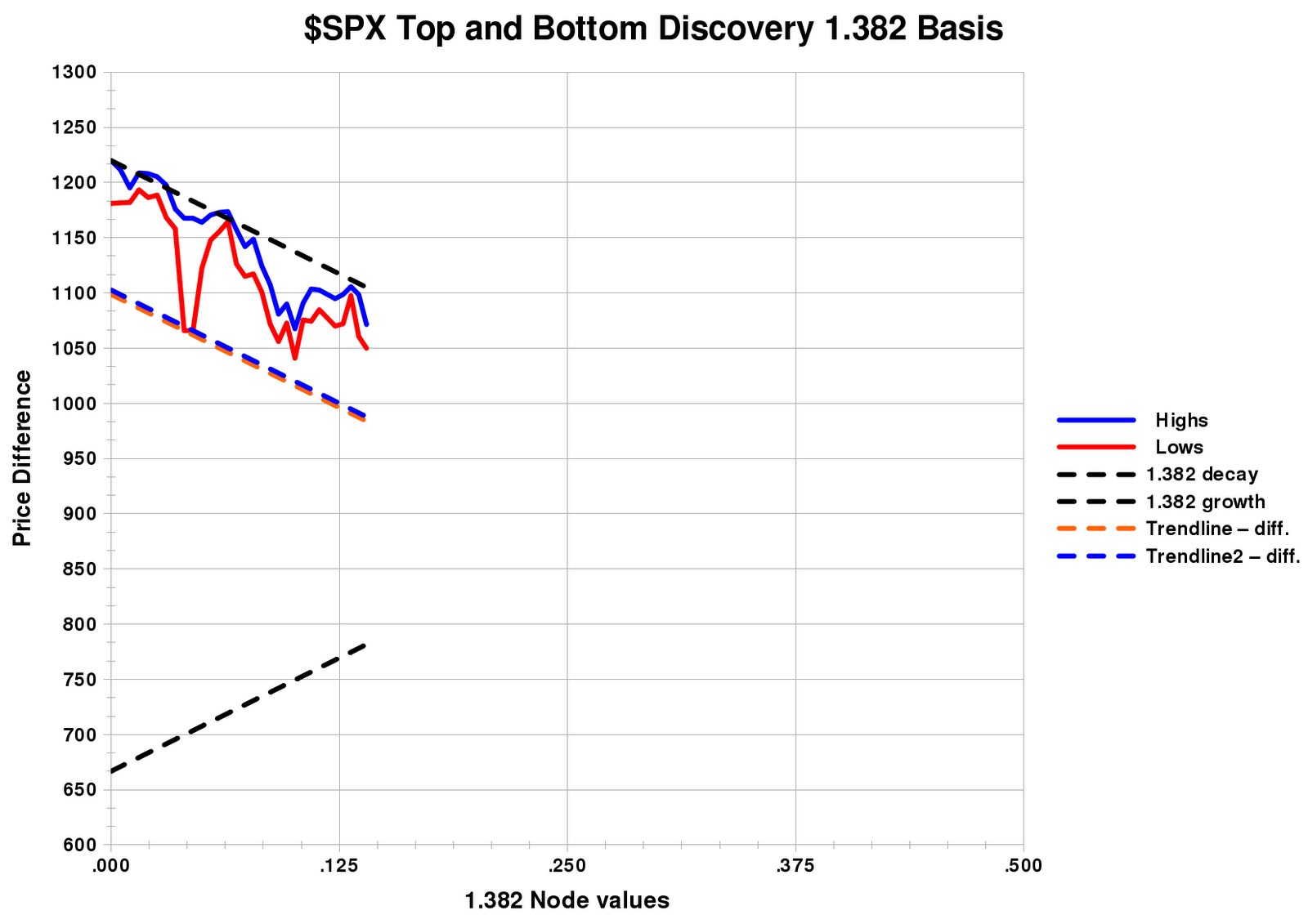
1.382 Basis, 6/14 at 1108.6

It would be easy to argue that the last one has already happened (today) and is a good match for reality. Todays candlestick looks like an important top, I should just accept it and go short, that would seem reasonable. I think collision with the 1.382 trendline did cause this reversal, but the game's not over yet. Since we're barely at the .200 node value (closer to the .500 node is the normal termination of a directional move), and I suspect this rally from 6/8/10 is, or should be, a typical A-B-C pattern, I believe we saw 'A' end today, then a drop will continue tomorrow which will be wave 'B', and then the 'C' wave will carry up to a target somewhere from the dates 6/18 to 6/23. I favor the longer target both because the 1148.37 price target gives a good right shoulder symmetry to the $SPX and because the trendlines on the middle 1.317 chart above, fits the three latest bottoms in the best way of the three models shown, and goodness of fit is how you try to evaluate your models...

One more point of note, there are 31 trading days from 4/26/10 to 6/8/10. If you extend out in time by a Fibonacci 38.2%, it puts you to the date 6/23/10....

Of course the market can ignore all of this and just tell me to go to hell, and then none of it aligns after today....

Modeling the rally...


Using the top on 4/26/10 and the 'Flash Crash' lows, and then the low of June 8th, I used these dates and prices as a Start-A-C pattern for the $SPX. Then building a spreadsheet with the highs and lows since the 8th, I get the chart above. Now, in fairness, I thought today would be a down day, and so far, it has not been. I saw negative divergence in some indicators and we were near the 'return trendline' shown in the diagram above as a dashed line. Refer to web articles, Google search 'return trendline'. The foundation for the channel I am creating is the brown trendline along the bottom of the chart. It is precomputed from the A-B-C pattern I have mentioned. Some inaccuracy can be assumed because of the short time scales more appropriate to intraday calculations, and I am doing this with daily data, which puts some obvious limits on fidelity. That said, we are only at less than a .200 node value and most moves get closer to .500 before they terminate. I still think we are near a minor top, (I thought that after the close Friday and over the weekend, though) but the real top I still think is several days away...Relative to the early node values we are at, I think there is time for this rally to build a 'right shoulder' to the April 26 top....

P.S. this chart looks way smoother than an intraday chart of the same time frame because I'm using only the highs and lows of those days...

P.P.S. Those of you familiar with the Math I'm using can build the same spreadsheet. The values I used are here:

Friday, June 11, 2010

The Keynesian Endpoint!


http://www.bloomberg.com/apps/news?pid=newsarchive&sid=abM7IKo.INIk


Stimulus as poison...finally realised? or postponed again?

BP: Is Team Obama Pushing for a Full Externalities Precedent? - Naked Capatalism


http://www.nakedcapitalism.com/2010/06/bp-is-team-obama-pushing-for-a-full-externalities-precedent.html


Is Obama growing some 'privies' finally?

Intraday $RUT trendline

Overall, a nice trendline...but you can see where I got stopped out, where it briefly broke...

Radiohead frontman: Music industry on verge of collapse

http://blogs.chron.com/celebritybuzz/2010/06/radiohead_frontman_music_indus.html

Collapsing...Like so many other things....

Senator Coburn: US Liquidity Crisis Coming in 2 Years – Unless…

No unless about it...It will happen, as our Financial leaders (Bernanke, Summers, Geithner et al.) are at best morons, and at worst, thieves. By the way, 'liquidity crisis' is just another name for 'Depression', but we can't say that word yet, can we?

http://www.cnbc.com/id/37615652

Jim Cramer on this link isn't one of my favorites either, just another Goldman boy, but he is right about what's coming...

Thursday, June 10, 2010

For completeness sake, here's the other $SPX charts with trendlines...

RIGHT SHOULDER FORMING?


Not a prediction per se, but since trendlines are usually exceeded slightly before price action fails, 1150-ish is not out of the question, which would give the $SPX a symmetric right shoulder to match the left shoulder roughly in height...

Looking now at both the $SPX and $RUT, I can see that the steeper precomputed trendlines are contained within the less steep precomputed ones (look at the top example both in this post and also the previous one), and the less steep ones constitute true channels that are heretofore not recognized. So after the right shoulders of these indexes have formed, prices will fall again, but initially at least, at a less violent pace....and contained within channels...

In the charts of the steeper trendlines, I forced channels using parallel lines keyed to the flash crash. Using the slower trendlines, the channels look less forced and seem to fit better...just my opinion... Earlier, I used the trendlines that fit well the steeply declining tops, which were computed in the normal way and used as the anchor(s) of the channels, and then created the parallel trendlines to those in order to fit (somewhat forced) along the two bottoms we had at the time. Now, after the last two days, it's now apparent that the three bottoms that have completed on both indexes since the top, are just naturally parallel (without forcing) to the other precomputed trendlines high up that I haven't talked about much or used. I suspect they now will be...

Here's the answer...


You can see from the graphs that the $RUT has a lot of room to run...so only the $SPX is somewhat trendline constrained, but it does have higher trendlines to go up to...so the rally is probably real, up to a point...

The top graph shows the trendline that has produced the bottoms in this index. Clearly the wedge that's forming is being driven by the internal math of these waves...it's not random....Now which trendline does it go up to? Probably the $SPX will hit it's higher trendlines at the same time...

By the way, here is the similar buy signal for the $RUT:


Here's that oddball signal, it's still there....

Although it got less pronounced late yesterday after a dramatic reversal that stopped me out, the signal is stronger today, although I think I'm not going to chase this one...I agree with Anonymous that there's too many wild cards out there right now...

With the intraday high currently 1086.16 here's the same chart at 2:30 central time:


You can see the funny 'hook' where the blue line and red line go vertical and overlap..that's what breakouts in their early stages often look like on this system. If I had had the guts to hang on yesterday, a small loss could have been a descent gain by today...but some of this stuff is experimental, theoretical, and I haven't field tested this exponential-log moving average system enough yet to know that it always works...

So the better part of valor...

P.S. The highest confidence breakouts are irrefutably confirmed when the blue and red lines go off the top of the chart....

P.P.S. If the market chooses not to breakout, if this is a bull trap of some kind, that is understandable too. This is the chart that suggests it will fail:


You can see where we are...right up at the old trendline...so it's make or break somewhere close to this price level...

'Flash Crash' Bollinger Band Statistics


Just for grins and maybe long term research, I have compiled how many Standard Deviations the 'Flash Crash' pushed down to on various indexes. The results are:

$SOX 4.5950
$RUT 5.0045
$NYSE 5.1346
$SPX 6.4519
$NDX 7.0448
$INDU 7.86945

Some pretty amazing numbers, and the resulting rally to the 5/13/10 top was influenced by these values...

Normally, of course, Bollinger Bands are computed at only a Standard Deviation of 2.0, which produces an envelope that contains most of the price action seen in markets...

Looking at the spreadsheet above, although I only have 6 examples, you can see the not unexpected tendency of the 'B' wave retracement to increase as the 'A' wave flash crash went deeper into the bands. Effects after the 'B' wave didn't really seem to be dependent on the Flash 'A' wave...

Wednesday, June 9, 2010

Keeping it simple....Green markers for Bull markets, red markers for Bear markets...


(Click to enlarge)

What I keep seeing...


Look at these odd wedges forming on these different indexes...I don't remember ever seeing such divergent patterns before across the different indexes....I'm not sure what to make of it....The bottom one, has of course, been 'transformed' a bit by my math programs, but it still looks basically the same as it's 'normal time' cousin, above it...

I went long this morning on leveraged $RUT ETF...

I'm having a good morning with this so far, expect a few days of upside before we hit the higher trendlines...

update:

It was an 'up' signal..I followed it up, it rolled over, I was stopped out for a small loss...

I've been whipsawed a bit the last couple of days...part of the game....

Tuesday, June 8, 2010

Overhead exponential trendline on the $SPX is at about 1100...

Now we'll see if it staggers up there and drops again...or goes through it for some reason...Today I got out with a small profit but it would have been bigger if I had pulled out about an hour sooner...I was really expecting the market to give me another 2% or so, oh well...Looking around I do see some divergences, but they weren't huge...except for some of the ones I check less often...like $NYMO....big positive divergence there..so we sit on the sidelines and wait...

Here are all of the trendlines relevant to the decline. The two thick orange trendlines represent both the trendline it's been following since the April top, and a higher one it could reach up to and follow (or bounce off of and come back down) if this market wanted to create a 'right shoulder' and decline from there...

Do we see an intermediate term bottom coming as we approach the weekly Bollinger Bands?


I think so...watch RSI on short time frames for fairly extreme readings as we get near the weekly BB's...Fibonacci considerations produce a possible bottom near the 1024 area...which is near the 1027.57 level of the weekly bands...

(click on the chart to enlarge it)

Update:

Fed engineered a bottom today at 1042.17, to create the illusion of a double bottom with 5/25/10. There seemed to me there was no technical reason for it, not yet oversold, not at Bollinger Bands...We'll see how well it sticks...

Monday, June 7, 2010

Market continues down....

The market's ($SPX) decline may pause briefly soon as the weekly Bollinger Bands are approached...but in general the decline seems strong at this point.

It's worth noting that the monthly Bollingers Bands are at about 740 and the quarterly Bollinger Bands are at 760...These levels should be watched as we approach them...a number of months into the future....

Of course, two things to remember about Bollinger Bands, (1) they move and (2) they usually are exceeded a bit before they work...

Today's chart:


Notice that the recent top of last Thursday (6/03/10) shows up on the chart as just a whisker past the .125 value on the X-axis (1/8 Node)....

Saturday, June 5, 2010

The slow death of the regulatory state


http://blogs.reuters.com/great-debate/2010/06/04/the-slow-death-of-the-regulatory-state/


At last the mainstream media is mentioning the obvious...That regulation everywhere is failing...From toxic financial products to toxic industrial products to toxic food items and clothing....Nobody is clamping down on this stuff...

Excerpt:

"Regulatory capture –where regulators come to share the interests and viewpoint of the industry they are supposed to be overseeing, rather than acting in the broader “public interest” — is nothing new. President Dwight Eisenhower warned about the power of the military-industrial complex in 1961.

But the scale of the capture across so many agencies, reaching into the heart of the regulatory state, under governments of all colors, is unprecedented in modern times.

It represents the largest “privatisation” of government since the Old Corruption of the 18th century (where government offices and laws were seen as an opportunity for private profit rather than a matter of “res publica” or the public interest)."


Spoken plainly, 'regulatory capture' is usually related to bribes and corruption....

The panic low of 5/25/2010...

Just for grins (and for my notes) I checked the values for RSI and the Ultimate Oscillator on the 15 minute charts for the $SPX and $NDX on 5/25/2010. The values for RSI were 15.86 and 13.95 for the $SPX and $NDX, respectively. For the Ultimate Oscillator, the equivalent readings were 24.15 and 24.95....

If you go to the 5 minute charts, you get for RSI, 10.862 and 8.904, and for Ultimate Oscillator 14.336 and 17.574, again for $SPX and $NDX in each case...

These are what major lows look like...although in this Bear Market, it will turn out only to have been a pause....

What would Hyperinflation look like?

There are many people concerned about excessive money printing (myself included). I found this site that describes what happened in Germany to the ordinary people in the early 20's, 'on the ground', as they went through such a crisis.

The experiences in the U.S. may well be turn out to be different, but this is instructive nonetheless...

Here's the link:

http://www.nowandfutures.com/us_weimar.html


After reading this, I can understand better what happened later in Germany...

Friday, June 4, 2010

Boycott BP!


http://www.citizen.org/boycott-bp


Sign the Petition, and pass it on!

Forgive us....

http://www.howestreet.com/articles/index.php?article_id=13629

These pictures say so much....

$SPX charts...


Both trendline charts are tracking the highs very well, and I suspect over time, one of the two charts will prove slightly more accurate, and I'll drop the less useful one...Right now in terms of the the Correlation Coefficient (Linear Regression stuff, for those that are familiar with it) shows that the top picture's trendline has a correlation of .993403 with the highs of this index, and the bottom chart's trendline has a correlation of .993726. Virtually identical accuracy exists for both charts. Right now, visually, I like the bottom one slightly more. Remember, perfect correlation is 1.00000. We're real close to that, about 7/10th of a percent off.

In case I forgot to say it, I went short late in the day yesterday, with a small position. Once we go below the 'flash crash' lows, I'll get more aggressive...

A Plague Upon The World: The USA is a "Failed State"

http://www.globalresearch.ca/index.php?context=va&aid=19458

Dr. Paul Craig Roberts was a former high official with the Reagan administration, and a deep and thoughtful guy.

His point here, is that the Bush-Obama administrations have shredded the Constitution. We are loosing/or have lost, Habeus Corpus, and other things. Since we are ethnically diverse as a nation, the Constitution was the only 'glue' there was. We are not a traditional country bound together by 'folk' traditions. Once it's generally recognized/understood that we no longer have the rule of law, our diversity will lead to anarchy, if I understand him correctly....

Market declining as predicted....

One of the stranger and more tragic things I see is how people coming in to this site are interacting with the charts I place here. The last post was headed by a conventional chart, showing a conventional trendline. The last two charts show the special trendlines I have created, which worked well this morning even as the conventional trendlines failed.

Guess which charts get clicked on to expand them for better visibility. The ordinary one at the top of the post, which produce no real information. The novel new ones, which performed well, got no clicks...

Makes me wonder about the fecklessness of people...

It also shows the power of the familiar, even if it's wrong....

Thursday, June 3, 2010

This morning's $SPX charts (so far)


Basically, these charts seem to be saying that we are now at another 'top'....This contradicts the daily MACD indicator and the put/call ratios, which looks so much like a warning of the beginning of a new up trend. The day is still young, but as of 10:50 CST, today's candlestick DOES look like a top,,,

The top chart shows a conventional trendline that will probably _not_ work...The bottom two charts show trendlines that _should_ work....

(Click on the individual charts to enlarge them)

Wednesday, June 2, 2010

Test of indicators coming...

If you look at daily charts, the MACD indicator looks to crossover in a positive fashion, it looks short term bullish. The next couple days will be critical in confirming the Bear. We have to see if MACD is warning us of some kind of pumping by the FED to overcome the Bear, or whether we are just seeing a small Bull trap forming, or whatever...Don't commit to too many positions either way until this resolves...

An introduction to Memristors

http://www.howestreet.com/articles/index.php?article_id=13590

Maybe able to model animal nervous systems....

This morning's Clickcharts...

Whenever the most recent bar turns red, I will go short...

http://www.clickcharts.com/Default.aspx?SID=SPX

Tuesday, June 1, 2010

CNN - Say goodbye to full-time jobs with benefits


http://money.cnn.com/2010/06/01/news/economy/contract_jobs/index.htm


And it's only a recession, right? Oh, I forgot, it's a recovery....

Rally from last Tuesday's bottom, struggling or dead?


UPDATE:

Maybe the little rally-ette is over. The $NDX today sported the kind of candlestick seen at tops ...

The other averages lost ground almost to the point below last Wednesday's close. If that happens tomorrow, then it's probably time to go short again...

Looking at the two regression plots above, I think the top one is now the closest fit, although I was previously favoring the bottom one. It takes a little while for the right regression line to announce itself sometimes...

For some reason the legend didn't show up on the snapshot of the top graph, but it's basically the same as the bottom one...

More States May Create Public Banks

http://www.yesmagazine.org/issues/water-solutions/more-states-may-create-public-banks

If every state did this, the Federal Reserve and it's cronies would have their legs cut out from under them. This would be a good thing....

Obama administration moves to distance itself from BP on oil spill response


http://www.washingtonpost.com/wp-dyn/content/article/2010/05/31/AR2010053103511.html


O.K., Obama is ready to take the gloves off against BP, as they have embarrassed him. Why can't he do the same with the bankers?